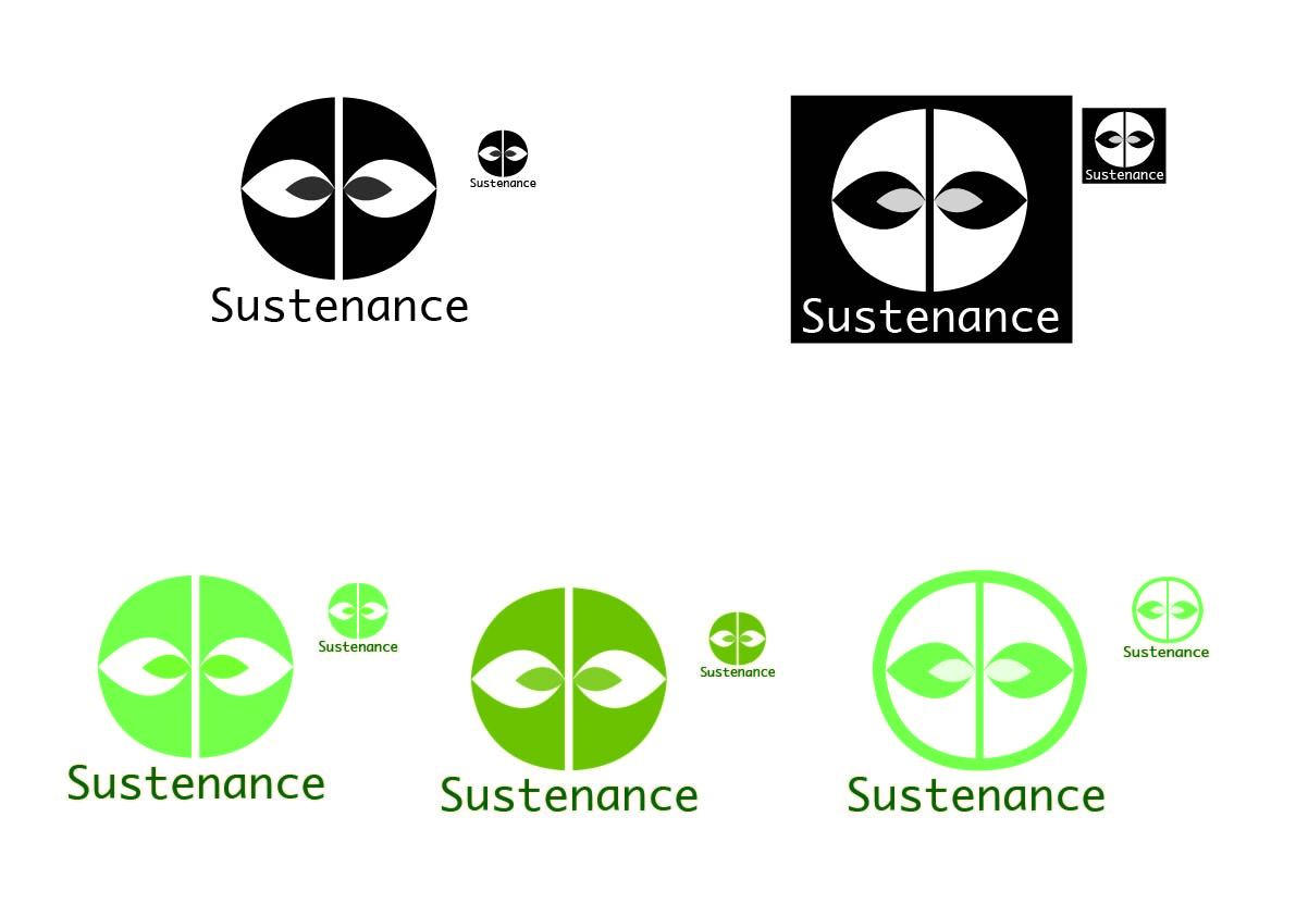


The
first four images are my attempts to alter the idea of the circular logo. When I first came up with the idea I thought
the white center looked like a plant, but when it was pointed out to me that it
also looked like a mask/eyes I tried to manipulate the basic ideas to avoid
confusion and properly represent Sustenance.
I tried altering the colour as I thought the green would create an
organic feel and I also tried deconstructing the shape to avoid the circle
looking like a face. Although I quite
liked some of these new designs, I again received the response from people who
were unaware of the intention of the logo that it looked like a mask/eyes. I then went back to the idea of using the
shape of the Great Australian Bight to represent both the company’s Australian
outlook and the food products the company produce. I tried to make it look juicy and fresh
through the use of colours representing juicy summer fruits and the droplets. Although these are starting to look more
interesting than my original Great Australian Bight idea, I’m still trying to
figure out the best shape to use for the symbol and get the right balance between
the symbol and the name.
No comments:
Post a Comment